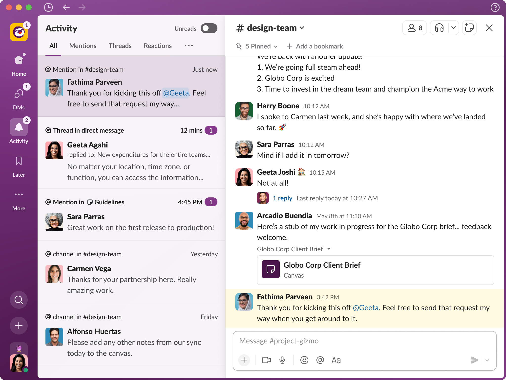
Slack has been given an enterprise-focused redesign aimed at making it easier to work across multiple workspaces. The Salesforce-owned collaboration platform now includes a persistent menu bar with messages and notifications available independent of the workspace. It also has a new default home view with access to all workspace channels.

The latest update will be rolled out over the coming months with a special focus on Enterprise Grid Layout customers. The company told Tech Monitor the design changes were inspired by updates to its iPad app where there were more focused views and less jumping between sections to get the information you need.
This is the first major redesign of the platform since Salesforce pivoted to become more of an AI-first company. This included adding new functionality to Slack such as its own AI chat bot and bringing in data from the Salesforce data cloud.
The new update has also been built to incorporate the different types of content launched since the last redesign, including ‘Canvas,’ an option allowing users to create shared documents. Additionally, channels and direct messages can now be created from a single, persistent ‘Create’ button on the new side menu.
“Moving quickly on routine actions is a small but powerful way to give you time back in your day for more meaningful work,” a company spokesperson explained. The ‘Create’ button can also be used to start a huddle with other people in the organisation.
Slack redesign prioritises search and productivity
The main focus of the design efforts has been on improving productivity. This includes quick views of latest messages and content updates, as well as more focused displays and fewer steps to reach content. “We know millions of people start and end their workday in Slack, so we took great care to ensure these improvements make it a more productive and pleasant home,” said Noah Weiss, Slack’s chief product officer, in a statement.
Launched in 2014, Slack started life as a simple messaging app for small teams and organisations but it has evolved into an enterprise workspace. During a briefing a product manager told Tech Monitor it was now an “indispensable productivity platform,” adding that the core of the redesign was to improve focus for users and drive productivity. In times where large enterprise users often find themselves bouncing between multiple workspaces, they explained, users will now have the option to view workplaces in a single view or in parallel with others. Teams can also access information immediately through a new “activity” view, showing the most recent posts, messages and ‘canvases’ across all of their workspaces.
“Slack is the place where your organization shares information and ideas, but that’s not happening solely in messages: you’re creating audio and video clips, you’re huddling with colleagues, you’re sharing links to work in other systems, and you’re using Slack as a repository to keep all of this information organized within your channels,” a spokesperson said. “The new design places more of these capabilities front and centre, putting more power in your hands, with fewer clicks.”
Salesforce has also updated the search function, putting the results in a main view pane then opening content next to the results. “When information is readily searchable, you can more easily make decisions and drive work forward, no matter where you sit within your organization,” the spokesperson added. “An update to the Search experience means you can click into each result to see its full context without having to jump back and forth as you look for what you need.”
The new design has also been built to be more customisable, including themes that change the colour of the user interface. There are a number of pre-built menu options including yellow, purple and blue. In future, users will also be able to add shortcut links to third-party applications used inside Slack.
Read more: Slack GPT: Salesforce messaging platform gets AI capabilities


